Understanding data patterns and correlations is key, and scatter plots help a lot. They show us how variables are connected in a visual way. This goes beyond just looking at random points. It lets us see the big picture – the trends and patterns within the data.
Scatter plots are essentially dots on a graph, showing the relationship between two sets of data. They’re great for seeing if one property affects another. For example, we can tell if they move together or not.
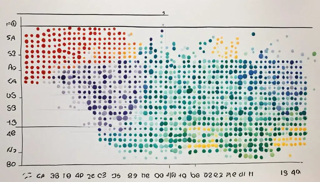
Scatter plots highlight not just trends but also other important features like clusters or unusual data points. By looking at how the points are spread out, we can understand more about the relationship between variables.

Key Takeaways:
- Scatter plots are valuable for observing and showing relationships between two numeric variables.
- They reveal patterns in the data and help identify correlational relationships.
- Scatter plots can be used to detect clustering, outliers, and other data patterns.
- These plots are created by selecting two columns from a data table and plotting each row as a dot on a Cartesian plane.
- Effective scatter plot analysis involves interpreting correlations, identifying strengths of relationships, and recognizing practical applications.
What is a Scatter Plot and How to Create One
A scatter plot shows how two things are related with dots on a graph. It’s like a map of the data where each dot is a piece of information. This way, we can see if there’s a connection or trend between them. To make a scatter plot, we choose two things to look at and put them on a graph. The graph has the x-axis and y-axis to show the different values. The x-axis is for one thing, and the y-axis is for the other. It makes it easy to visually understand the data.
There are four main steps to make a scatter plot:
- Select the variables: Pick the two things you want to see if they are related. They should make sense to look at together.
- Label the axes: Name the x-axis and y-axis based on your chosen variables. If needed, include their units.
- Plot the data points: Look at each data point and place it on the graph. The x-axis shows one value, and the y-axis shows the other.
- Analyze the scatter pattern: After plotting points, check the graph. This helps find trends, groups, or odd points. It shows the relationship between the variables.
Scatter plots are great for showing how things are connected. They are used in many fields to study and present data. By learning how to use scatter plots, you can understand data better. This lets you make smarter choices based on what the data tells you.

Interpreting Scatter Plots and Their Application
Scatter plots help us see how two things are related. It’s key to know how to read them. Understanding correlation is very important. It tells us how the variables are linked.
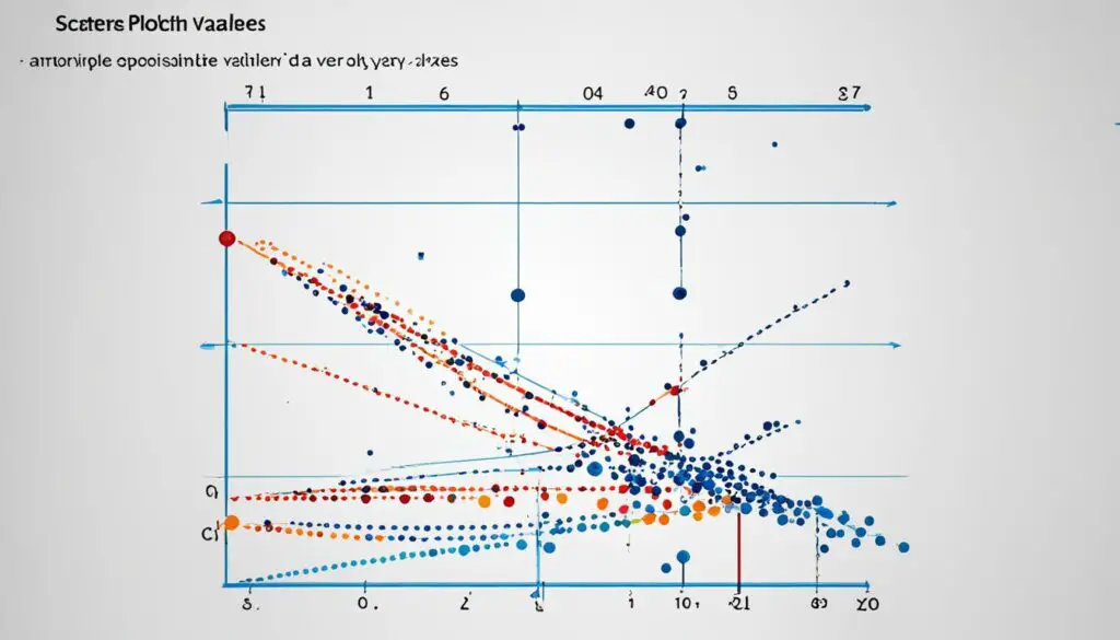
Correlation can be positive, negative, or not there. A positive correlation means both factors increase together. If one goes up and the other down, it’s a negative correlation. With no clear pattern, there’s no correlation. Looking at the scatter plot shows us this and how the variables work together.
How closely data points follow the trend line shows the strength of their relationship. Data points close to the line show a strong relationship. Those scattered tell of a weak one. When they group somewhat but not too closely, it’s moderate.
Scatter plots are big in many fields. In business, they spot trends or help predict markets. In health, they link patient data to treatment success. And in schools, they find links between study time and grades.
They also show if one thing truly causes another. Outliers, very different data points, can reveal a lot. They might highlight special cases or errors in the data. Scatter plots are great for making smart choices by clearly showing the connections.
“Scatter plots give us a visual representation of complex data, allowing us to make informed decisions and gain a better understanding of the relationships between variables. They are a fundamental tool for data analysis in various industries and fields.”
Real-Life Example
Let’s look at a business using scatter plots. They want to see how ad spending affects sales. Plotting the data shows any trends clearly. This helps them figure out the best marketing moves and budget use.

Conclusion
Scatter plots are a great way to see how two things are connected. But they have limits. They can show connections but not why they happen. For full meaning, more tests are needed.
Getting your data ready is a big part of using scatter plots well. Make sure your data is correct. You need a big enough group to draw real insights. Also, think about other factors that might be at play. This can help you understand your scatter plot better.
Explaining your scatter plot well is crucial. Adding background info can make findings clearer. Scatter plots are very useful even with their issues. They help in finding patterns and relationships, making complex things simpler.
FAQ
What is a scatter plot?
A scatter plot, also known as a scatter diagram or scatter graph, shows two variables’ relationship. It’s a way to visualize data in two dimensions.
How do I create a scatter plot?
To make a scatter plot, pick the two variables to study. Name the axes with these variables. Then, place the data points where they fall on the axes.
What insights can I gain from a scatter plot?
Scatter plots help you understand how two variables are related. You can see if the relationship is strong, weak, or doesn’t exist. They also help spot any trends, outliers, and understand cause and effect.
What are the practical applications of scatter plots?
Many fields use scatter plots, including business, finance, and healthcare. They help find patterns, look at cause and effect, and make decisions. Basically, they’re great for any study on relationships between variables.
What are the limitations of using scatter plots?
Scatter plots can’t prove one variable causes another. They may need more tests. Plus, the data must be accurate, and there should be enough of it to trust the insights. When using scatter plots, always remember – there might be more factors at play.


